I think user interface (UI) design is really important. While well-designed menus & gameplay UI can’t save a bad game, they can make a good game feel even more polished. And luckily, I really like doing UI design – the functional part, that is. I’m not an artist and don’t try to make things pretty, but I can handle usability and layout.
I’m done fleshing out the functional mockups for Project Smart Birds’ menus, so I wanted to share them and the rationales for many of the decisions I made.
Process
My process for functional mockups is pretty simple. It’s all pen and paper until I’m done, then I scan it for a digital copy. First I use a lot of “scratch paper” to narrow down what to do. Then once I know what I want, I draw each screen’s mockup into a pre-printed rectangle of the appropriate dimensions. My iOS templates have 8 rectangles per sheet of paper, with each rectangle a little larger than an iPod 4’s screen.
Goals
My high-level goals for the menus are few and straightforward:
- Menu layouts should be appropriate for iOS (mobile & tablet) AND for other platforms like PC and console. I don’t mind making tweaks later, but I want a solid base that won’t need to be completely redesigned.
- While still meeting the above, try to stick with solid iOS standards & conventions. Since iOS is my lead platform, I want the interface to be familiar and friendly to iOS gamers.
- Consolidate info where possible, and try to minimize clutter.
General Guidelines
Here a few guidelines I’ve decided on that affect most menus.
- Menus have header text, and a few menus have sub-headers as well. Some might argue that headers are overkill, but for a puzzle game with a wide target audience, I think the additional clarity is a good idea.
- The Back Button is on the bottom-left. Different games use a variety of back button placements, but bottom-left is as close to a standard on iOS as I could find. And other platforms like the Wii and DS use bottom-left even more consistently, so I think this is the best choice.
- Most buttons have an icon in addition to text. Icons are pretty and reinforce the button text. And in the case of certain icons, the icon design will help portray aspects that aren’t communicated in the text.
Menu Details
Now for the main event. For each menu, I’ll show the mockup (in some cases, slightly censored as some details are still under wraps) and give details on why I made the decisions I did.
Main
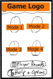
- There are 4 modes, with 1 button each. The layout of these mode buttons will make more sense once the pretty visuals are in.
- All Player Record stuff (stats, leaderboards, achievements) are consolidated into a single button and corresponding menu. Same with Help & Options – a single button and menu for these as well.
- When designing a Main menu I always try to limit the number of buttons to 6 or less, unless there’s a very good reason to have more. I’m sure I got this advice from someone wiser than myself, but it still makes sense to me – any more than this and it can become a bit overwhelming for the game’s primary menu. Luckily the consolidation mentioned above was feasible.
Game in Progress
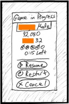
- This is a pop-up that appears if you select a mode that has a saved game in progress. It’s a pop-up instead of a full-screen menu because I want it to feel like you haven’t yet left the source menu. If you decide to cancel, I want it to seem like you never left – not that you left and came back upon cancelling.
- I wanted to display key details of the saved game in progress, so you could consider that info when you decide whether to restart. I was surprised that a number of other games – like Bejeweled iOS – let you restart without showing you what you’re about to delete.
Restart Confirmation
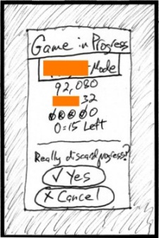
- Also a pop-up, and the saved game’s details are still shown. If you decide to restart, I make you confirm. I figure the extra tap is worth avoiding a few accidental restarts.
Player Records
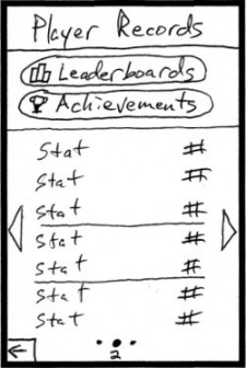
- For the initial iOS version of the game, Leaderboards and Achievements will be handled via Game Center. I’ll theme the icons for these buttons with Game Center’s 4-quadrant color scheme to hint to the player that they’re Game Center related.
- There are multiple “pages” of stats. You can swipe to change pages, and there are status dots – like on the iOS main interface. There are a couple additions too:
- A page number is shown under the current dot. Angry Birds does this and I thought it was a nice touch.
- The sides of the screen have arrows you can tap to change pages, in case the player prefers that instead of swiping. Also, the arrows visually reinforce the fact that there are multiple pages.
- The buttons for Leaderboards and Achievements will always be shown. The page-changing only affects the stats part of the screen.
- My initial idea was for this to be a single page that vertically scrolls, like Game Center’s Leaderboard and Achievement pages. I like the idea of consistency with those, but it was going to be extra work for little gain. Although the vertical scrolling on its own would be pretty easy, if I were to do it I would want to add arrows and a scroll status bar, adding more work to the task. And I already needed the multi-page system for one of the Help sub-menus, so I decided to save some time and just reuse that style here.
Help & Options
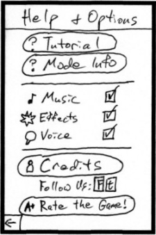
- Quite a bit going on here. There wasn’t enough in either category to justify having individual Help and Options menus, but there was too much to try sticking the components on, say, the Main menu. So I put it all together here, along with the credits / social media / rating stuff you see at the bottom (which seemed like the best spot for these stragglers).
- For the audio options, note I did toggles and not volume controls. A couple key points about this:
- From my perspective, if you balance the audio correctly, nobody will want to change the individual component volumes. So I’m removing that complexity and putting the responsibility on me (where it should be) to have a good audio balance.
- However, I think allowing per-component muting is worthwhile, in case a player just doesn’t like the music, VO, etc. That way they can turn off what they don’t like without muting the whole game.
- Why checkmarks? I considered slider toggles like you see in the iOS Settings app. If you look at those, you can drag the sliders gradually, or just tap/release to immediately toggle. If I did the sliders, I wouldn’t want to half-ass it and just do the tap – if a slider looks like it can slide, then it should – but I didn’t want to bother with both methods. So I decided on checkmarks instead, which are obviously tap-only.
- I’m on the fence about the Rate the Game link at the bottom. Some games have one of these, but many don’t. Still, I’m going to leave it in for now. I can always remove it later.
Mode Info
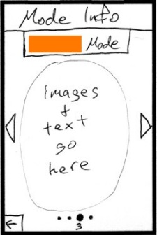
- I’m hand-waving (stalling on) the content of this screen for now, but the framework is set. The multi-page setup is like the Player Records menu, with the swiping, numbered dots, and arrows.
- As for the content, I plan for it to be a few sentences that summarize the goals and key rule changes for that page’s mode. Plus, I’ll have a few helper images if warranted. I’m confident that I can keep the info concise enough to fit each mode’s details on a single page.
Credits
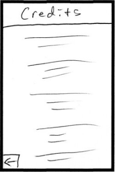
- These are simple auto-scrolling credits. The player can swipe up or down to temporarily override the auto-scroll and effectively rewind or fast-forward.
Pause
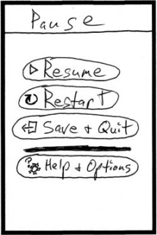
- The Pause menu is a full screen and not just a pop-up because I want the playfield to be entirely covered, so the player can’t cheat in a timed mode. Many puzzle games do this, for good reason.
- The functionality here is pretty standard. Resume and Quit are absolutely necessary. Restart and Help & Options access aren’t as important and some games don’t include those in their Pause menus, but I think they’re worth it.
- One key thing is that I’m explicitly calling out the fact that the Quit button saves the game. Many puzzle games do save upon quitting but they don’t make it clear up front – you don’t even know it’s saved until you attempt to play that mode again. So I’m using the button text to give players confidence even before they quit for the first time.
- I initially had appropriate Help buttons and Option toggles directly on this menu. The stuff all fit, but it was busier-looking than I wanted the Pause menu to be. So I decided to de-clutter and just link to the existing Help & Options menu. Now, some buttons on that menu may not be valid mid-game (specifically the Tutorial and Credits), so I’ll grey them out if need be.
- If restarting, I’ll bring up the Restart Confirmation pop-up I showed above, so you can be reminded of the progress you’re about to trash before you restart.
Results
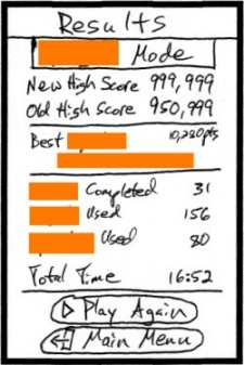
- There’s LOTS of info here, and I’m worried that it may be too busy and distracting. I plan to use a small (but not too small) font for the lesser stats in the middle of the screen. Fingers crossed that the menu will look OK once it’s real art, but if it ends up still too busy, I have a stat in mind to remove.
- I always show your score AND the (previous) high score, even if you just surpassed it. As a player, if I just got a new high score I want to know how much of an improvement it was. But too many games just don’t show the old high score – disappointing, but I’ll do better here.
- I’m using “Main Menu” on the button here instead of “Quit,” because the game is already over so you wouldn’t actually be quitting. But since it’s a similar action I think it’s appropriate to reuse the Quit icon.
References
As I worked on this menu stuff, I referenced the menus of a bunch of iOS games. Not to copy from, but to get a feel for what works well, to see trends, and to look for new ideas. Here are the games I looked at the most – thanks to the developers for the inspiration!
- Bejeweled
- Bejeweled Blitz
- SpellTower
- Puzzlejuice
- Bookworm
- Angry Birds
- Sky Hero
- Cut the Rope
Closing
And that’s it for this post! Hopefully a few people find this info interesting or useful. I welcome any questions or comments, so send them my way if you have them. Thanks!